“The role of the designer is that of a very good, thoughtful host anticipating the needs of his guests.”
Sell me this pen is the famous prompt because a pen is easy to romanticize. A pen signs the deal. A pen writes the novel. A pen might survive long enough to be handed to your child with a small speech about ambition.
Soap is harder.
Soap is cheap, wet, and designed to disappear. Nobody checks into a rental and calls home to describe the shampoo. If it works, it is forgotten by checkout. If it does not work, it becomes a review.
That is why Hosty Club is still my favorite project.
For most of 2016 and 2017, I tried to make a box of travel toiletries meaningful to Airbnb hosts. I changed its name, shape, color, contents, audience, software, and business model. I drew maps, designed bottles, built the storefront, designed the iOS app, took the photographs, wrote the copy, sent the emails, made the sales decks, and negotiated with vacation-rental companies. I did all of it myself.
The soap barely changed. The understanding around it changed constantly.
Five boxes, one question
What would make a host care about soap?
A method, not a diagram
Hosty began at 30 Weeks, an experimental school and incubator assembled by Google Creative Lab with SVA, Parsons, Pratt, and Cooper Union. I was one of 25 students selected for the program. The names around it included John Maeda, Scott Belsky, and IDEO founder and Stanford d.school co-founder David Kelley, among many others.
That pedigree could make the place sound grander and tidier than it felt. In practice, 30 Weeks was a room full of unfinished ideas being subjected to contact with other people. The curriculum did not teach design as the decoration of a correct answer. It taught design as a way to find out which question was worth answering.
The Stanford d.school often summarizes the process as empathize, define, ideate, prototype, and test. The useful part is not the five words. Its own Design Thinking Bootleg treats them as tools you can enter in different orders, repeat, and change. A prototype is not a small, precious version of the final product. It is something concrete enough to provoke a better conversation.
Hosty became my longest version of that conversation. Every box looked like a packaging decision. Most of them were actually decisions about whom I was serving.
Airbnbox: start by knocking
The first version was called Airbnbox. The name was not subtle. Neither was the hypothesis: put the little necessities of a hotel into one package, then leave it in a home rental before a guest arrived.
On paper, the customer was obvious. Airbnb hosts bought the box. But there were two people in the room even when only one of them was physically there. The host paid for it and had to replenish it. The guest opened it and decided whether it felt generous, cheap, useful, confusing, or wasteful. The host wanted better reviews. The guest wanted toothpaste at 11:45 p.m. These were adjacent needs, not identical ones.
So I started contacting hosts. I recently found one of the outreach emails from the end of 2015, just before the project became the thing I spent 2016 and 2017 building:
Archive no. 01 / host research disguised as a flattering listicle
Hi Irena,
I really like your place! I'm the founder of Hosty Club - we provide amenities to luxury Airbnb hosts & superhosts, and we're putting together a list of our top 10 favorite hosts of 2015. I'm wondering if you'd have the time for a quick interview to be featured in our blog post, which will gain you more attention as a host!
All we ask is that we can talk for 5 mins in person at your place, and in return we'll give you 3 Hosty Boxes and feature you in our post.
Hope to hear from you soon!
Sincerely,
Connor Lee
It is an earnest founder email. It offers exposure, free boxes, and an interview in approximately the wrong order. I love it.
More importantly, it got me into the context where the product would live. Five minutes in a host's apartment could answer questions that a week of arranging sticky notes could not. Where would the box sit? Did a host want to leave a whole kit for each reservation or refill loose bottles? Would guests understand that the contents were theirs? Did a welcome gift feel hospitable or like a hotel impersonation?
The interview was not preparation for the work. It was the work.
The blue zig-zag box: make utility visible
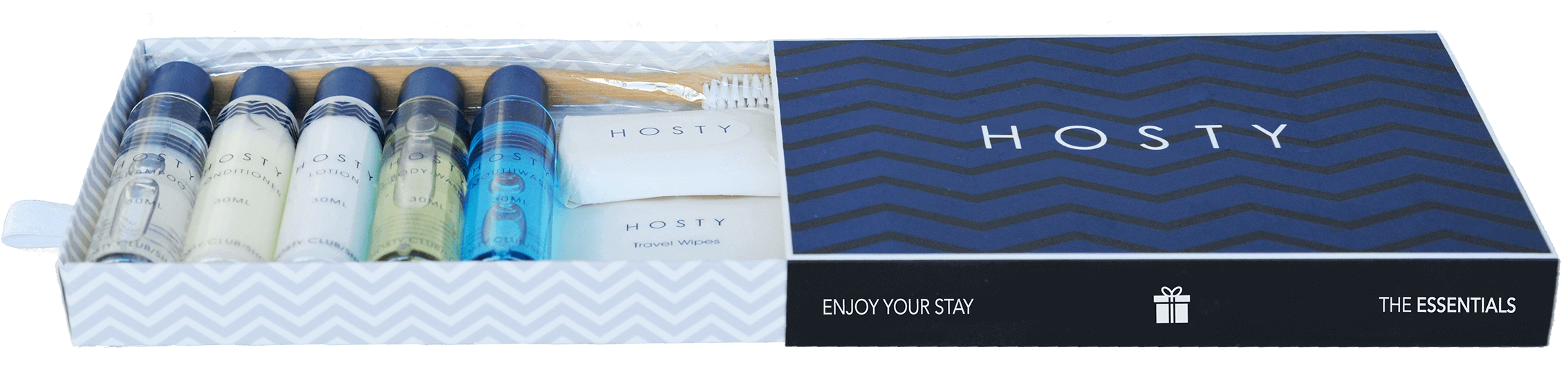
The first proper Hosty production run was navy blue and covered in a zig-zag pattern. It pulled open like a small drawer. Inside were travel-size toiletries organized as a set; outside, it said Enjoy your stay.
This version answered a basic problem with Airbnbox: a pile of minis is inventory, but a box can be a gesture. The packaging gave a host something deliberate to place in the room. It also gave a guest permission to use it. There was no awkward calculation about whether the shampoo under the sink belonged to the owner.
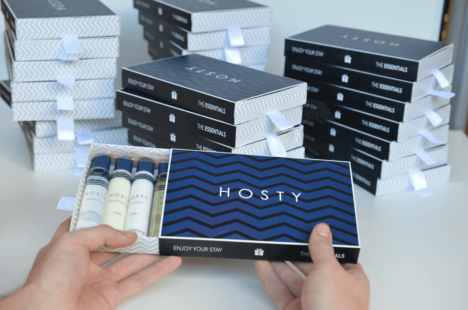

I built a functioning ecommerce site around it and took roughly $1,000 in pre-orders. That number was not evidence that the model had won. It was enough evidence to keep asking harder questions.
The blue box was conspicuous and gift-like, but it could have appeared in any city. Airbnb's appeal was precisely that a stay was not interchangeable with every other stay. I had designed a nicer commodity when the more interesting material was the place around it.
Put the city in the box
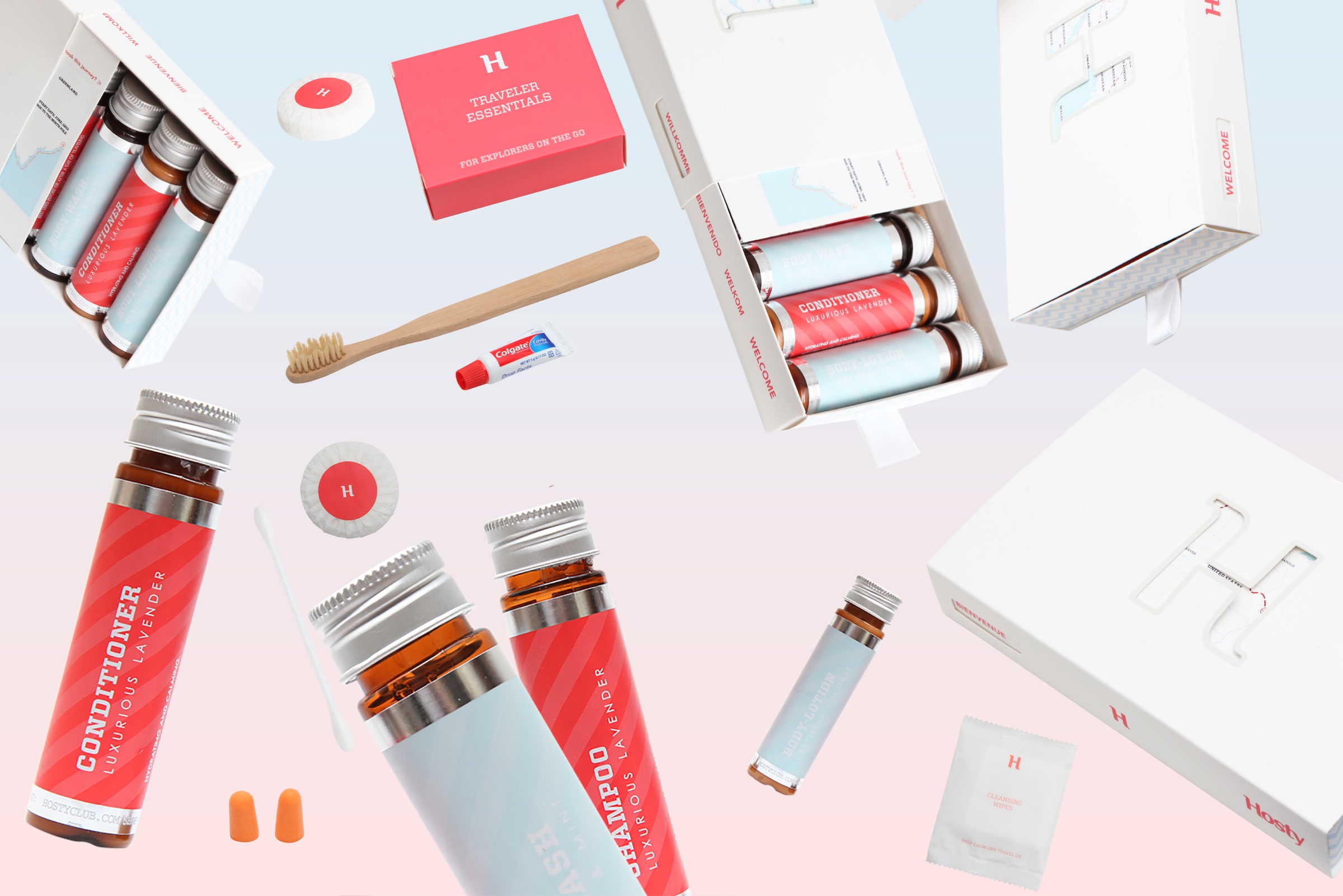
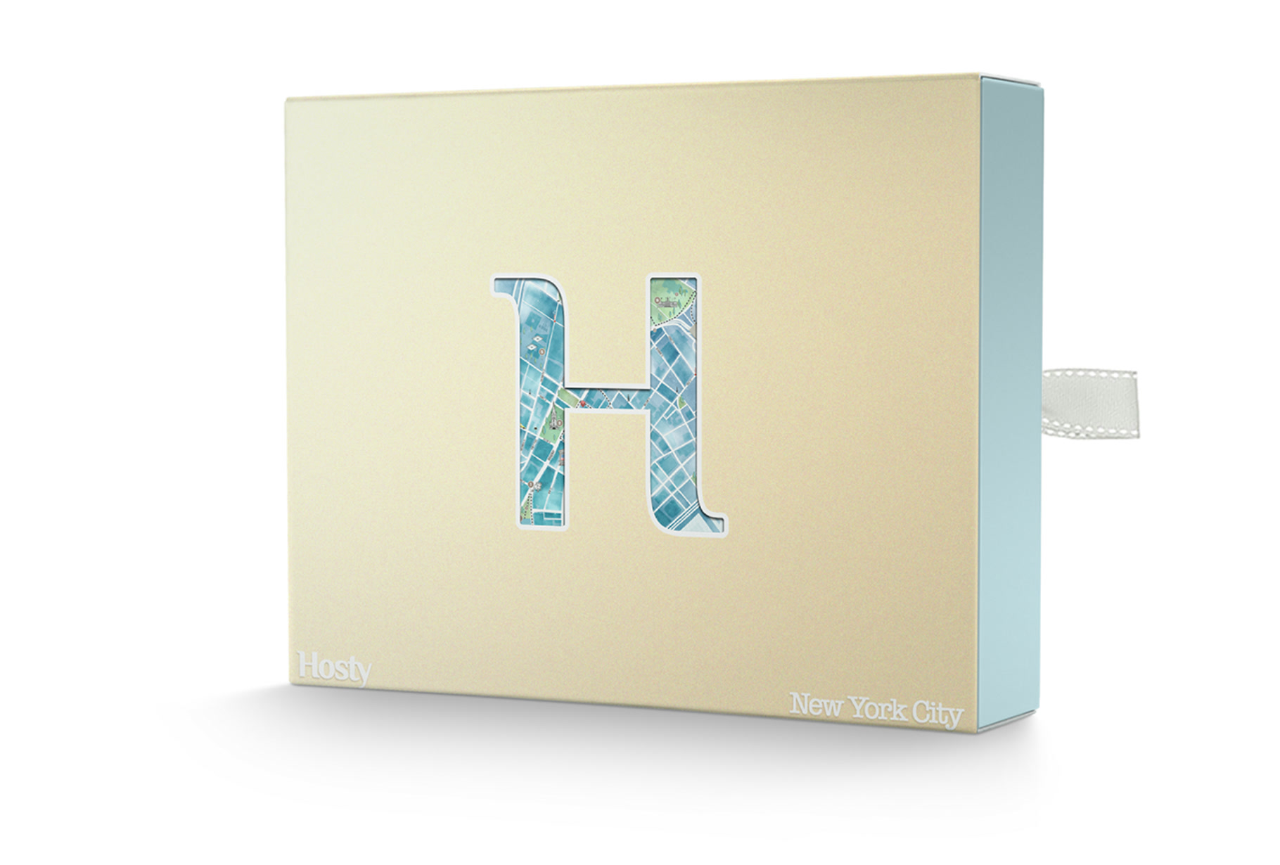
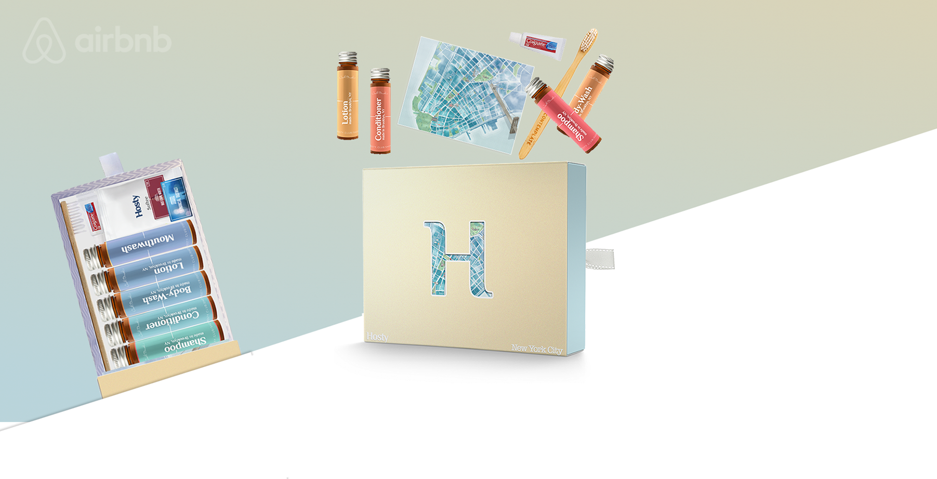
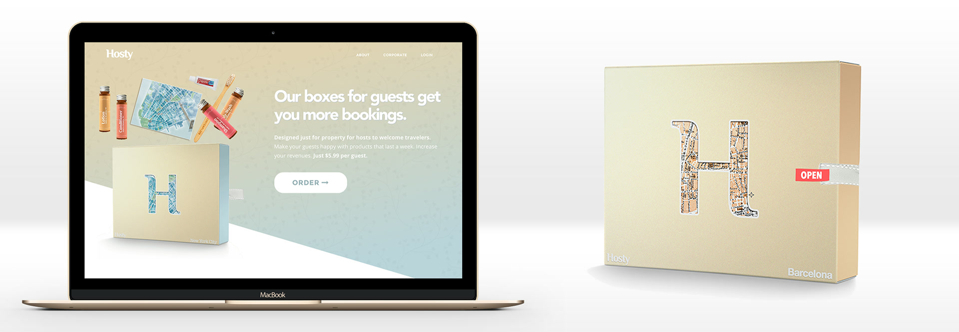
The next Hosty became softer, more organic, and location-specific. Amber bottles replaced the generic tubes. Labels distinguished shampoo, conditioner, body wash, and lotion through color. A die-cut H in the lid revealed a map underneath. New York, Barcelona, San Francisco, and other locations could each have their own edition.
That move did more than improve the packaging. It changed the product's center of gravity from toiletries to arrival.
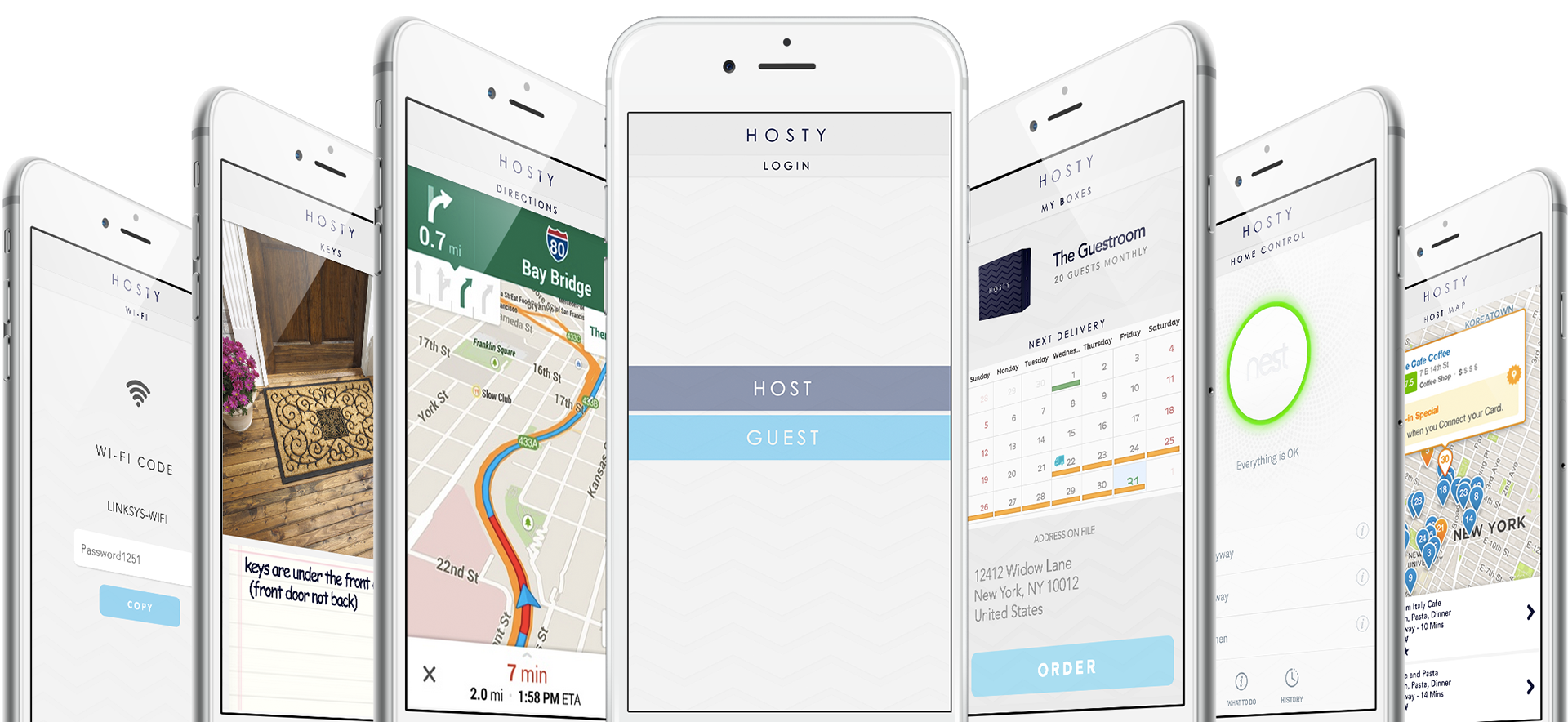
The companion app explored the same idea digitally. A guest could find the Wi-Fi password, see where the keys were hidden, get directions, browse a local map, or understand the controls in the home. A host could manage boxes and deliveries. The physical kit and the interface were two sides of the same question: what does a stranger need in the first ten minutes inside an unfamiliar place?
Location made an unremarkable category specific. It also made the project legible to people who did not care about hotel shampoo. The location and map work eventually led to a cold call from Andrew Mason, which is an improbable sentence to owe to a travel toothbrush.
The call was exciting, but its real value was diagnostic. An artifact can travel farther than an explanation. A person who would never schedule a meeting about "amenity fulfillment" might call after seeing a small box turn a city into a welcome ritual. Good prototypes do not merely demonstrate a solution. They attract the conversations that tell you what the solution might become.
The white box: design the behavior
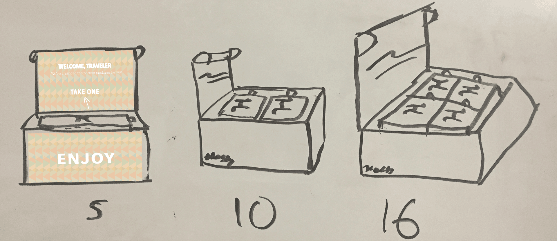
By 2017, the host-facing version had become a white drawer system with pale blue zig-zag sides, coral labels, a ribbon pull, and WELCOME printed around the tray in several languages. The outer shipping box opened to say WELCOME, TRAVELER. An insert instructed the host to take one set for the arriving guest.
The best part of this version was not visual. It was operational.
The box had to tell the host what to do without a manual. The sets had to look individual so guests would not take five shampoos and zero conditioners. The bottles had to survive shipping, fit in the drawer, and still feel considered on a bathroom counter. The host needed to know when to reorder. The guest needed to recognize the object as a welcome, not a minibar with hidden prices.
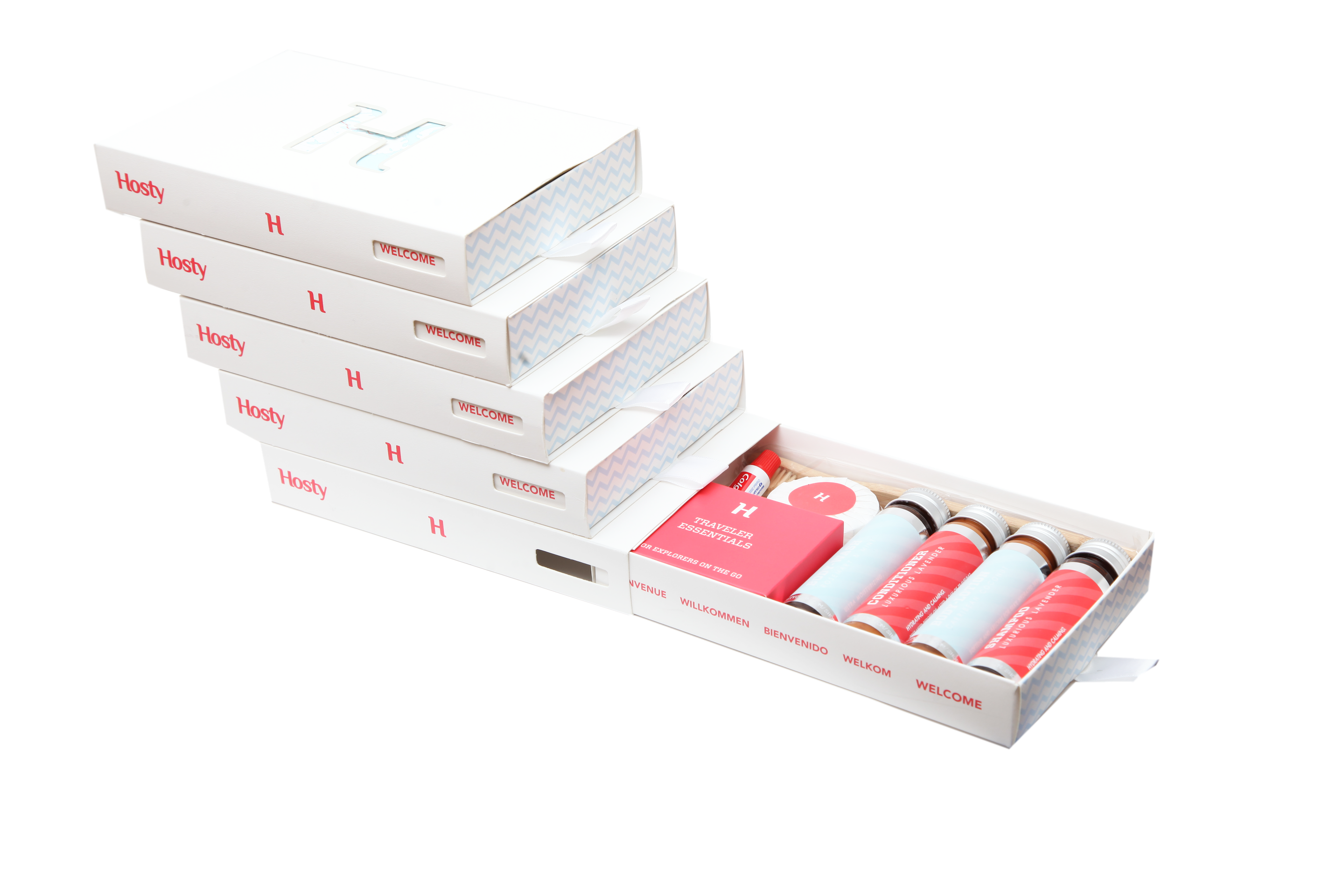
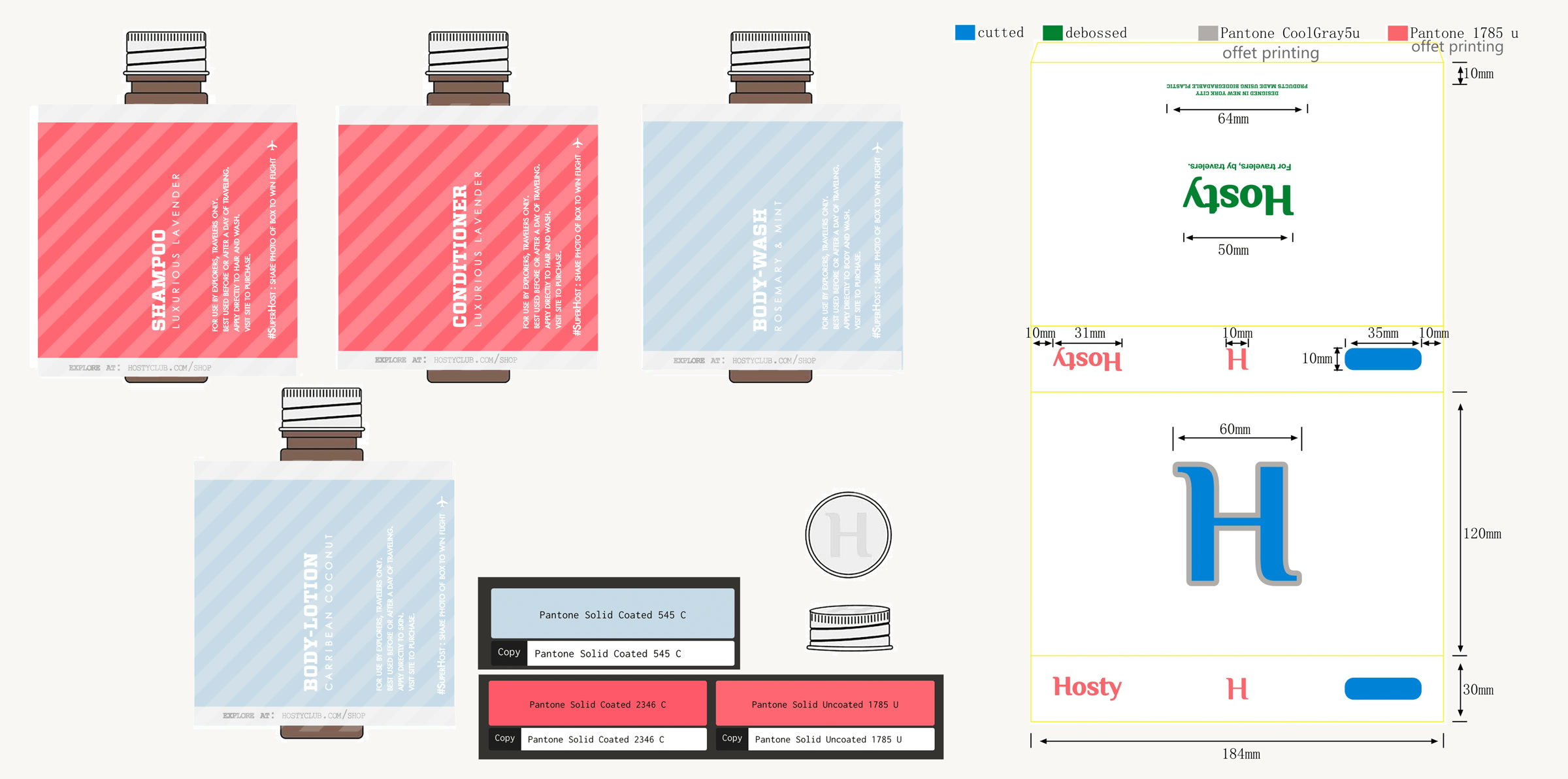
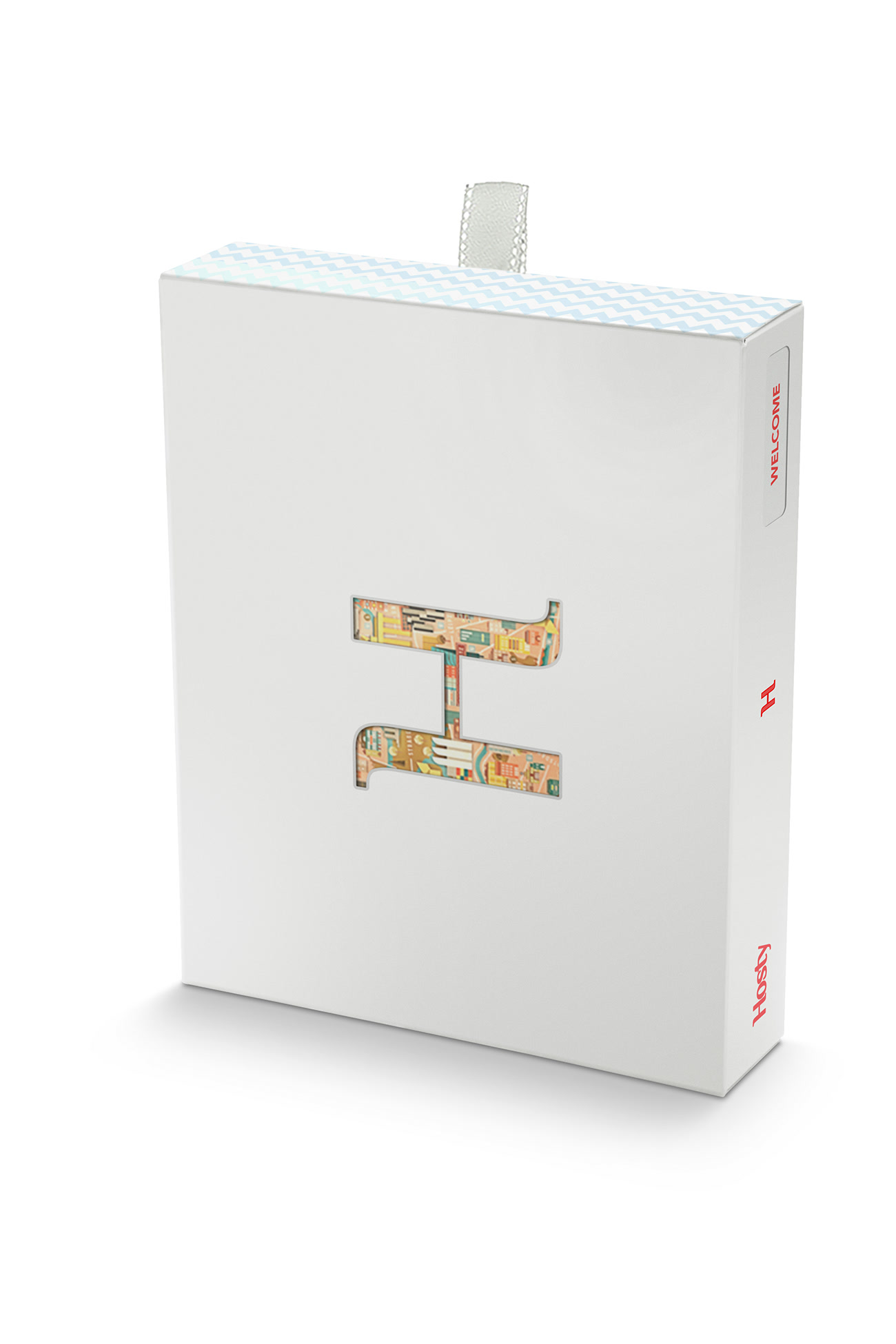
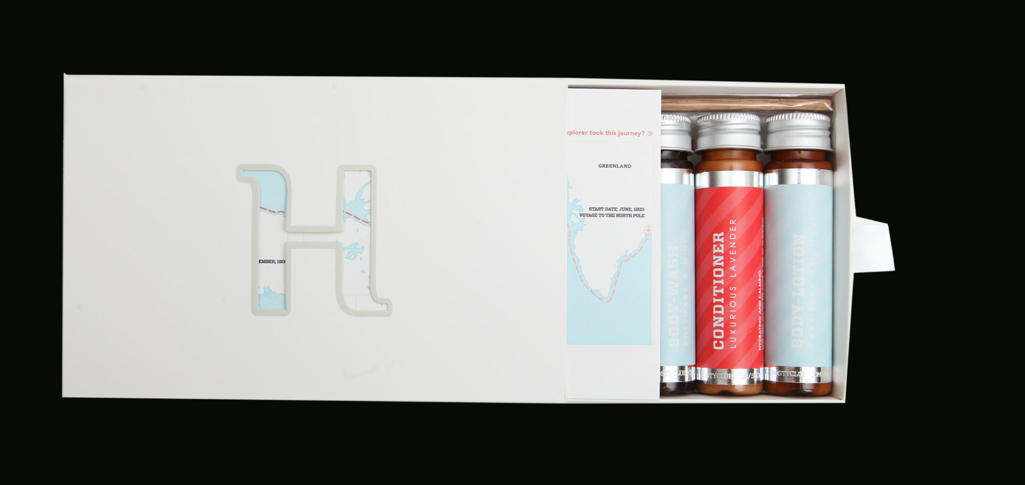
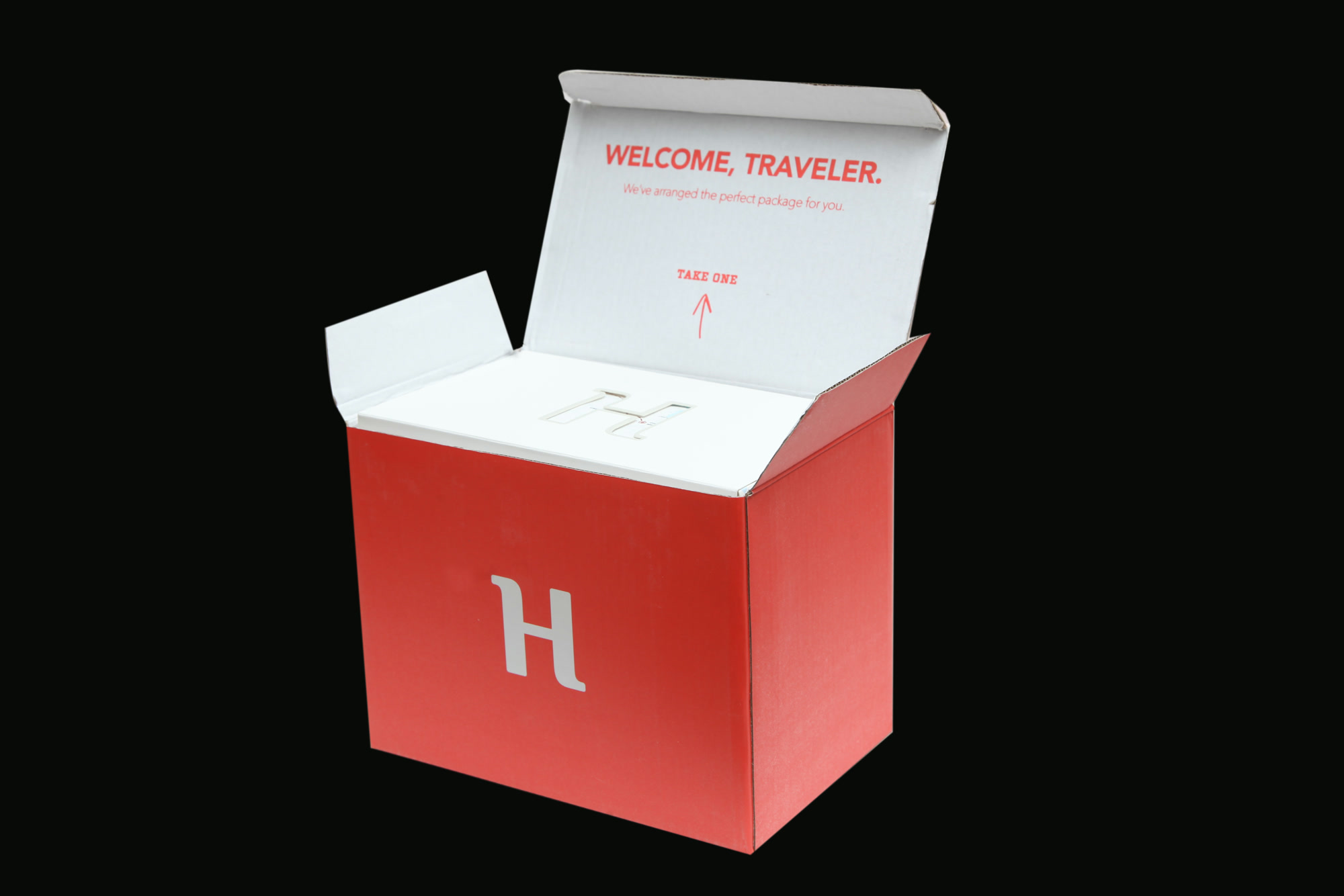
Design Milk covered the launch in August 2017. Their inventory of the box is almost comically practical: shampoo, conditioner, body wash, lotion, soap, toothbrush, toothpaste, shower cap, cleansing wipes, earplugs, and cotton swabs. Nothing in that list is novel. Novelty was never the point.
The design work was in turning eleven forgettable objects into one intelligible behavior: before the guest arrives, pull out a set and leave it for them.
This is where "sell me this box of soap" stops being a sales challenge. If I have to give an elaborate pitch every time, the object is still doing too little. The box should explain who it is for, when to use it, and what kind of host placed it there. The best sales copy was the pull-tab.
Then the customer changed
Independent hosts were emotionally right for Hosty and operationally difficult. They ordered in small quantities, on irregular schedules, across many addresses. The very fragmentation that made Airbnb interesting made the replenishment business hard.
Vacation-rental management companies had the opposite shape. They managed hundreds or thousands of stays. They already had a reservation system, a cleaning cadence, and a reason to make one property feel connected to a larger brand. They did not need Hosty's logo in the bathroom. They needed their own logo to mean something after an anonymous marketplace had made the booking.
So Hosty pivoted to B2B white-label welcome sets.
I began negotiating with large vacation-rental management companies that wanted a durable brand impression at the one moment the internet could not provide it: when the guest opened the door. The proposal decks stopped leading with a charming subscription box and started showing quantities, custom packaging, fulfillment, and system integration. A RedAwning concept priced production at 5,000, 10,000, and 15,000 boxes. Another deck laid out custom maps, branded inserts, nearby warehousing, and replenishment.
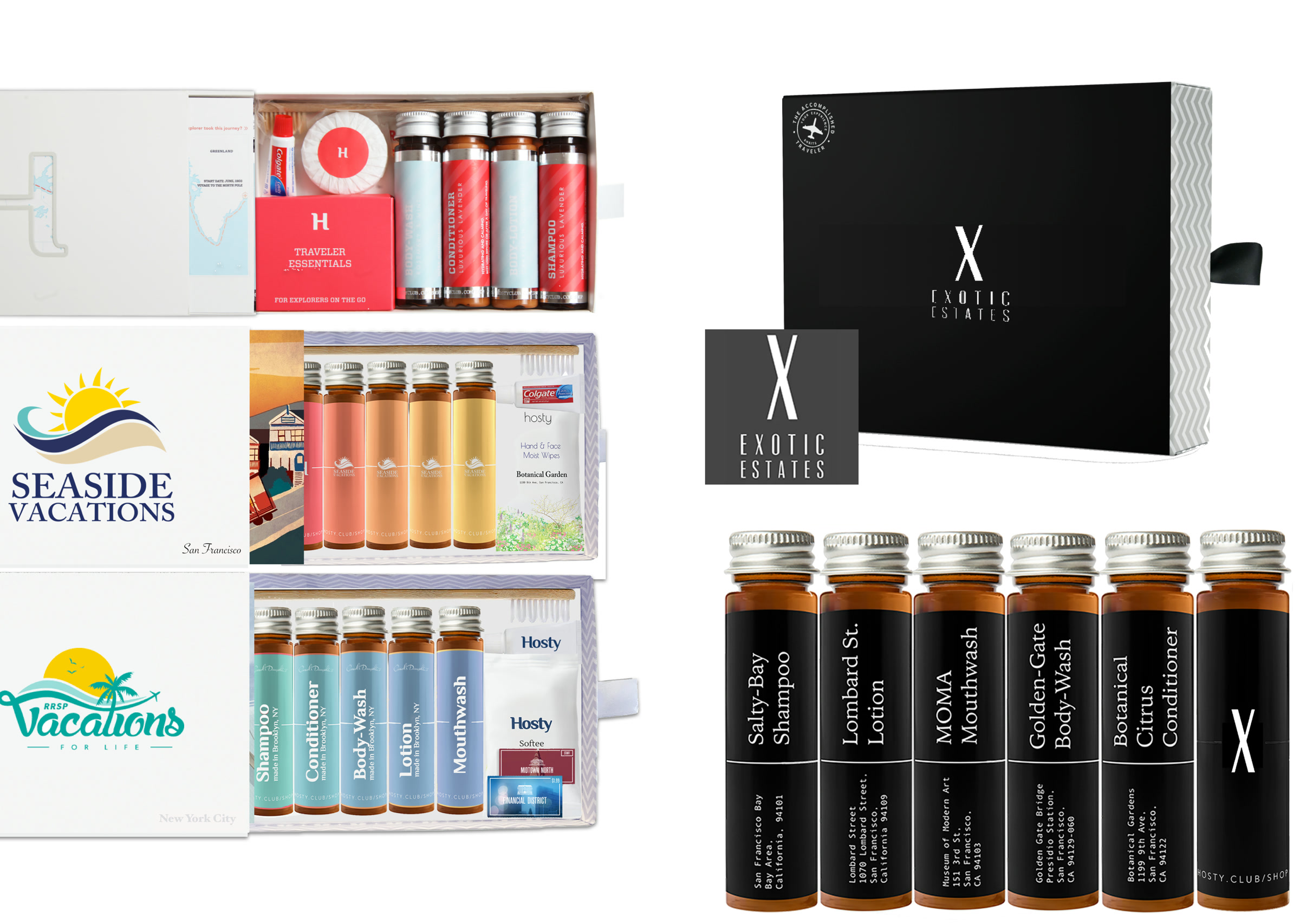
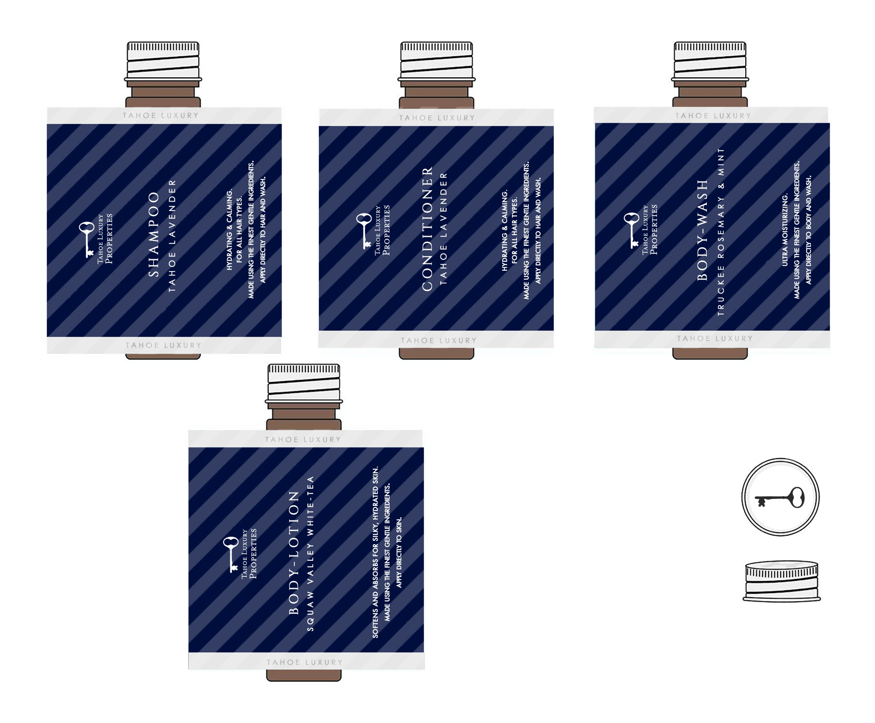
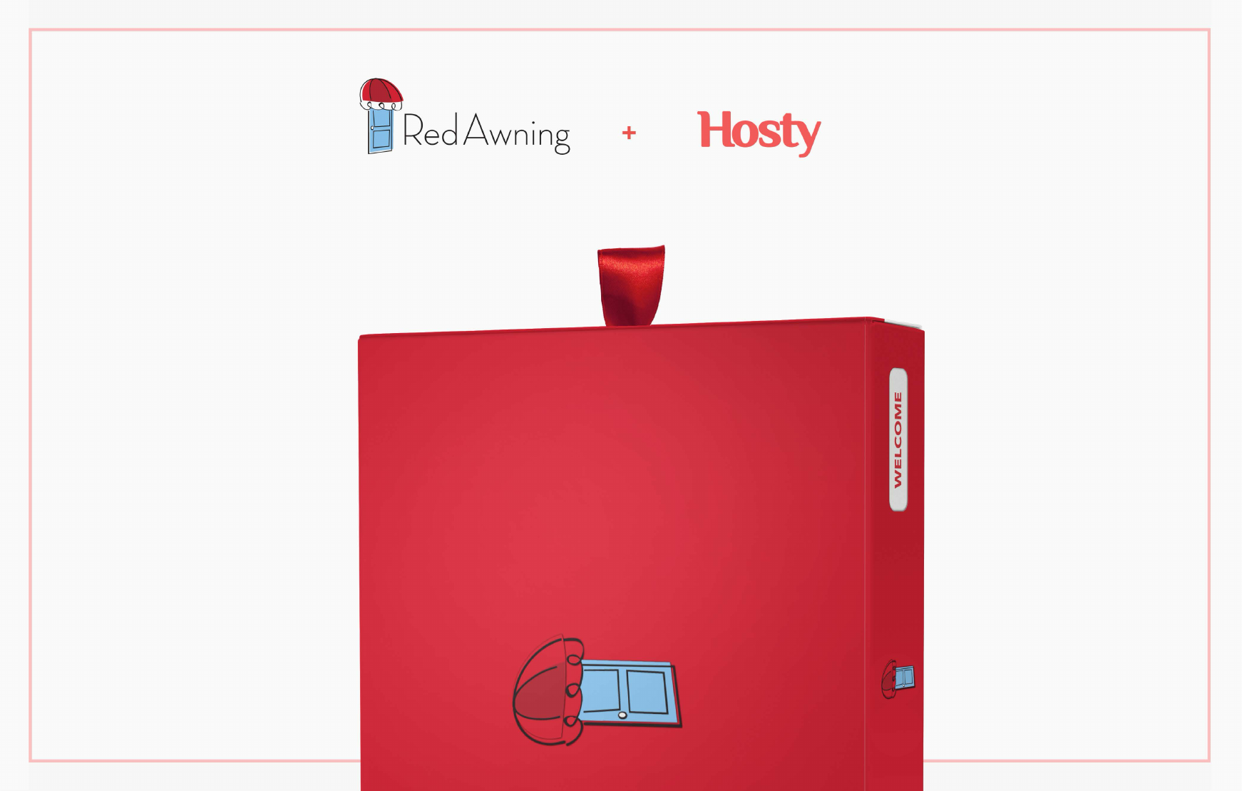
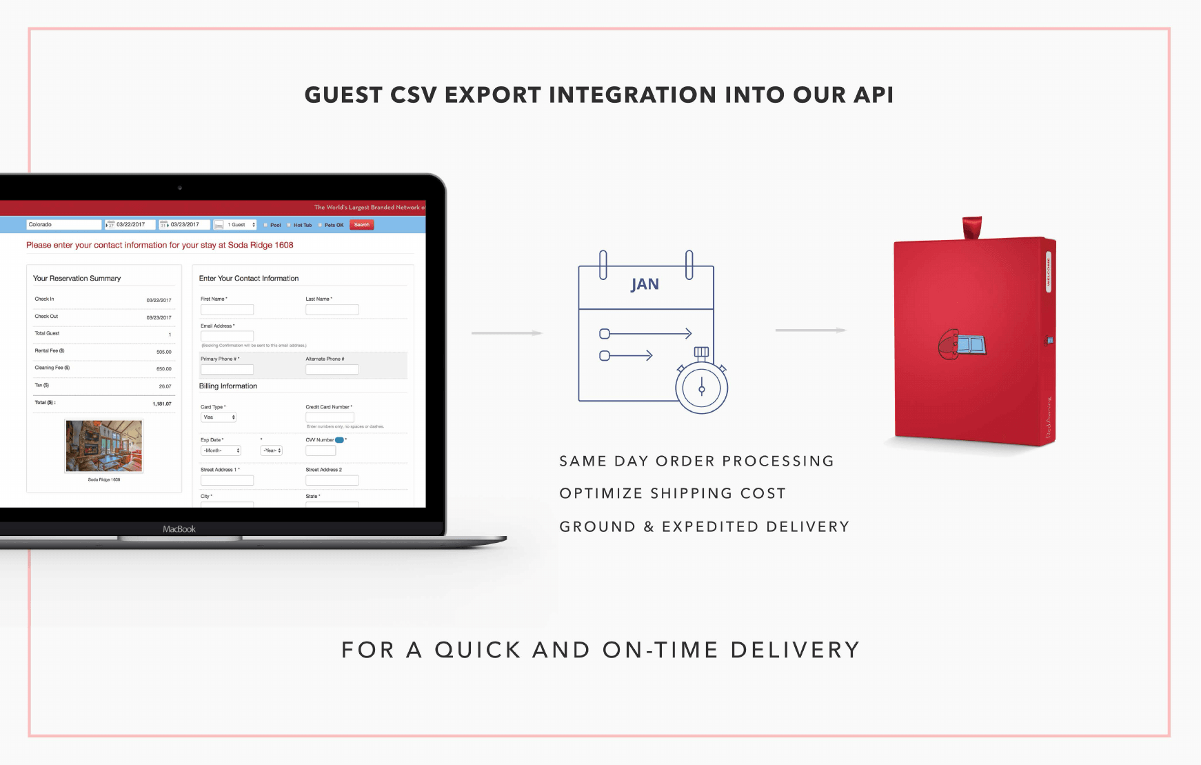
The most revealing page in the RedAwning deck was not the packaging render. It was a diagram: guest CSV export into an API, then same-day order processing, optimized shipping, and a branded box arriving on time. The product was no longer a box. It was a service choreography with a box at the end.
That change also clarified the actual brand problem. Online travel agencies owned the discovery and transaction. Property managers risked becoming invisible between the marketplace confirmation and the front door. A useful, well-timed physical object could introduce the company that was actually responsible for the stay. Maps, local material, return-booking offers, and small calls to action extended that introduction after the soap was gone.
This is still the clearest version of the idea on Hosty Club's current site: a welcome from the rental brand, not from the booking platform.
Five boxes, five better questions
It is tempting to retell a project like this as a straight line. First I had a crude idea. Then I applied design thinking. At the end, wisdom and a beautifully photographed box emerged.
That is not how it happened.
The process was recursive and occasionally embarrassing. I made things too early. I fell in love with visual systems that solved yesterday's problem. I built an app before the service model was settled. I used a consumer brand to discover that the larger opportunity required that brand to disappear. Some iterations were insight. Some were simply the cost of learning in public.
But each artifact made the next question more precise:
- Airbnbox: Will hosts pay to spare guests a small inconvenience?
- Blue zig-zag: Can basic amenities feel like a gift instead of inventory?
- Organic and local: Can the welcome carry the identity of a place?
- The white box: Can packaging teach the host's operating ritual by itself?
- White-label: Can the same ritual make a rental company memorable?
That is design thinking without the workshop theater. Empathy was standing in hosts' apartments and watching where things went. Definition was realizing the buyer and user were different people. Ideation was not a wall of speculative features; it was maps, drawers, kits, labels, and service models. Prototyping meant making them real enough to photograph, ship, price, and criticize. Testing meant accepting that a successful box could still reveal the wrong customer.
I did the entire project alone. That matters to me, but not because solitude is inherently virtuous. I was the founder, researcher, identity designer, packaging designer, product designer, photographer, copywriter, front-end developer, ecommerce operator, outbound salesperson, and the person moving a bottle three millimeters to the left before taking the picture. When the market changed the question, I could carry the answer across every layer without a handoff.
It also meant I could not hide a weak assumption inside another department. If the box was confusing, that was my packaging. If the site did not convert, that was my interface or my proposition. If a sales call went nowhere, that was new research arriving without the courtesy of a research session.
The packaging archive, iOS app archive, and the fuller AP3 case study preserve the polished objects. What I remember is the motion between them.
What the soap was for
Hosty did not become the enormous company my 30 Weeks brain could imagine for it. I do not love the project because it proves I was right. I love it because it left such a complete record of changing my mind.
The blue box argued that toiletries could be a gift. The map box argued that the real product was arrival. The white box argued that hospitality could be operationalized without becoming cold. The RedAwning box argued that the person who paid for the experience might need to be remembered more than the person who assembled it.
All of those ideas were inside the same soap. I could only see them after putting it in different boxes and handing it to different people.
So: sell me this box of soap.
If it is only soap, I cannot. The drugstore already has it, and probably cheaper.
If you are a host, it is one less late-night emergency and one small way to say that a stranger was expected. If you are a guest, it is evidence that somebody thought about your arrival before you got there. If you run a vacation-rental brand, it is a physical introduction at the exact moment your service becomes real.
The design-thinking answer is not a better pitch. It is to keep changing the box until the person holding it no longer needs one.