There is a photograph of me in Betterment's SoHo office with both thumbs up. Behind me, a whiteboard is covered in boxes, arrows, and a small mountain range of equations.
I look as if I had just solved finance. I had not. I was the intern.

Twenty people in SoHo
In 2013, Betterment was about twenty people in one office. This was eight years before a funding round valued the company at nearly $1.3 billion, before the word unicorn belonged anywhere near it. The company still felt like a room.
Betterment is still private, so there is no live public market cap. That September 2021 round remains the latest company-disclosed valuation I can verify. What has changed in public is the scale: Betterment now reports more than one million customers and more than $70 billion in assets under management. Assets under management are not valuation, but they make the distance from that SoHo room tangible.
My title was intern. The more accurate word was apprentice. I worked under Jon Stein, close enough to the unfinished decisions to see the product, the language, and the company being worked out at the same time. That proximity was the education. A design did not arrive with its reasoning cleaned up. You saw the question while it was still a question.
The office had an arrivals board
I also coded. In Python, I built a dashboard modeled after a train-station arrivals board. It displayed the location of new signups and the goals attached to their accounts. On that screen, growth did not look like one number going up. It looked like people arriving.
The board made the philosophy visible across the office. A signup was not an anonymous trade. It was a person, somewhere, deciding what their money was for.
The whole portfolio had a handle
Early Betterment was an argument against making people become portfolio managers before they were allowed to invest. The interface compressed the decision into two legible things: stocks and bonds.
Looking back from the meme-stock era, the contrast is sharp. I think of it as goal-based value investing, with value defined in human terms. The interface began with what the money was for, then worked backward to allocation and time. It was the opposite of YOLO-ing into a meme ticker and inventing the purpose afterward.
The 2010 homepage said it plainly: “Simply move a slider to control your allocation between our two investment baskets.”
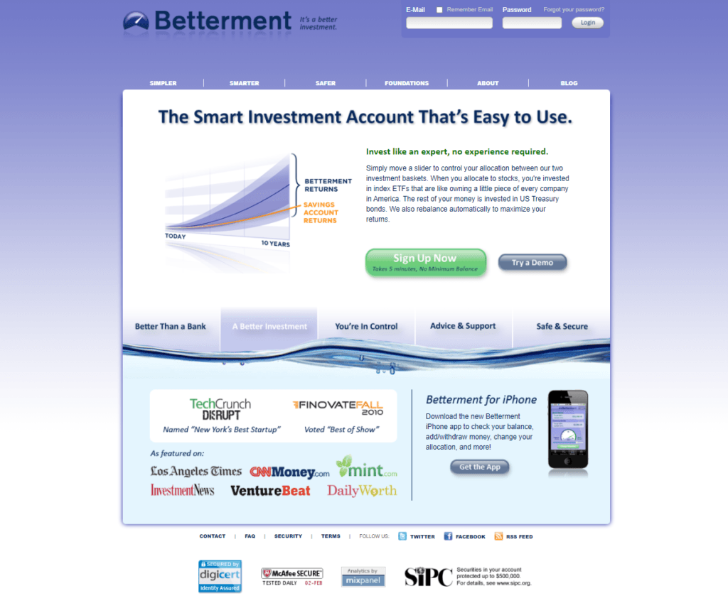
Under that slider sat index ETFs, automatic rebalancing, projected returns, and the obligations of a regulated adviser. Above it were two labels and a handle. The slider did not pretend risk was simple. It made the tradeoff visible.
That was designing for delight. Not decoration. Relief.
A surviving capture from 2014 shows how far the idea could stretch. Bonds and stocks sit at opposite ends of one line. Deposit and time controls sit beside it. A range of possible futures fills the rest of the screen. The interface connected how much you could put away, how long you had, and how much risk you could live with, then let those variables answer one another.
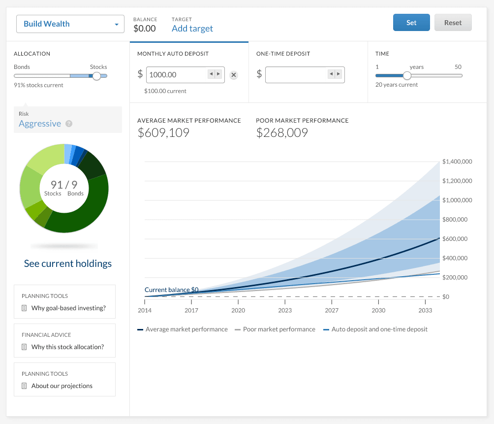
Stocks and bonds are not delightful. Agency is.
It was so simple it was hard to explain
My notes from April 25, 2013 are a page of possible ways to say the same thing. “Financial advice 2.0.” “Smart advice made simple.” “Your financial life without worry.” The phrases keep circling an absence. Less hassle. Less anxiety. Less time spent acting like your money should be a hobby.
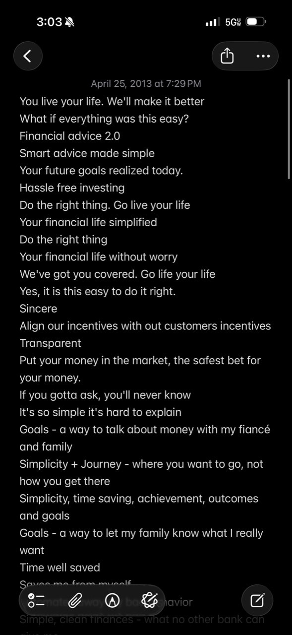
The most honest line is buried halfway down: “It's so simple it's hard to explain.” A few lines above it is the actual design brief: “Do the right thing. Go live your life.”
The success state was leaving.
Where the complexity belongs
Working under Jon left me with a definition of simplification I still use. Simple is not what a system is. It is what a system feels like after the team has decided where the complexity belongs.
Bad simplicity deletes necessary truth. Good simplicity carries it for you. Betterment still had to carry market risk, portfolio construction, rebalancing, compliance, and time. The person on the other side got a slider. One gesture did not erase the machinery. It gave the machinery a human scale.
I still look for that handle in every difficult product I design. In the photograph, I am giving the office two thumbs up. The product only needed one.